BarChart
Analogy Description
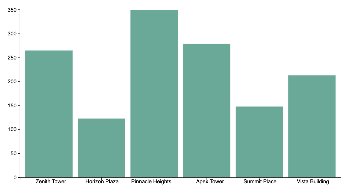
Imagine you’re gazing at a city skyline where each building’s height represents a specific data value. In a Bar Chart, these buildings line up side by side, making it easy to compare their towering heights.
Skyline of Data
Each bar in the chart is like a skyscraper, constructed to a height that reflects its value. The taller the skyscraper, the larger the value it represents.
Exploring the Streets
As you stroll along the “street” at the base of the skyline (the x-axis), you can spot how certain skyscrapers (bars) dominate the skyline while others remain relatively short. This visual comparison helps you quickly identify which values are the highest and which are the lowest.
City Blocks and Categories
Each building also represents a distinct “block” or category in the city. Think of them as districts, each with its own purpose and identity. When you view them side by side, you gain insights into how different blocks (categories) measure up against one another.
Chart Data (Read-Only)
Visualization Analogy

Actual Chart