BubbleChart
Analogy Description
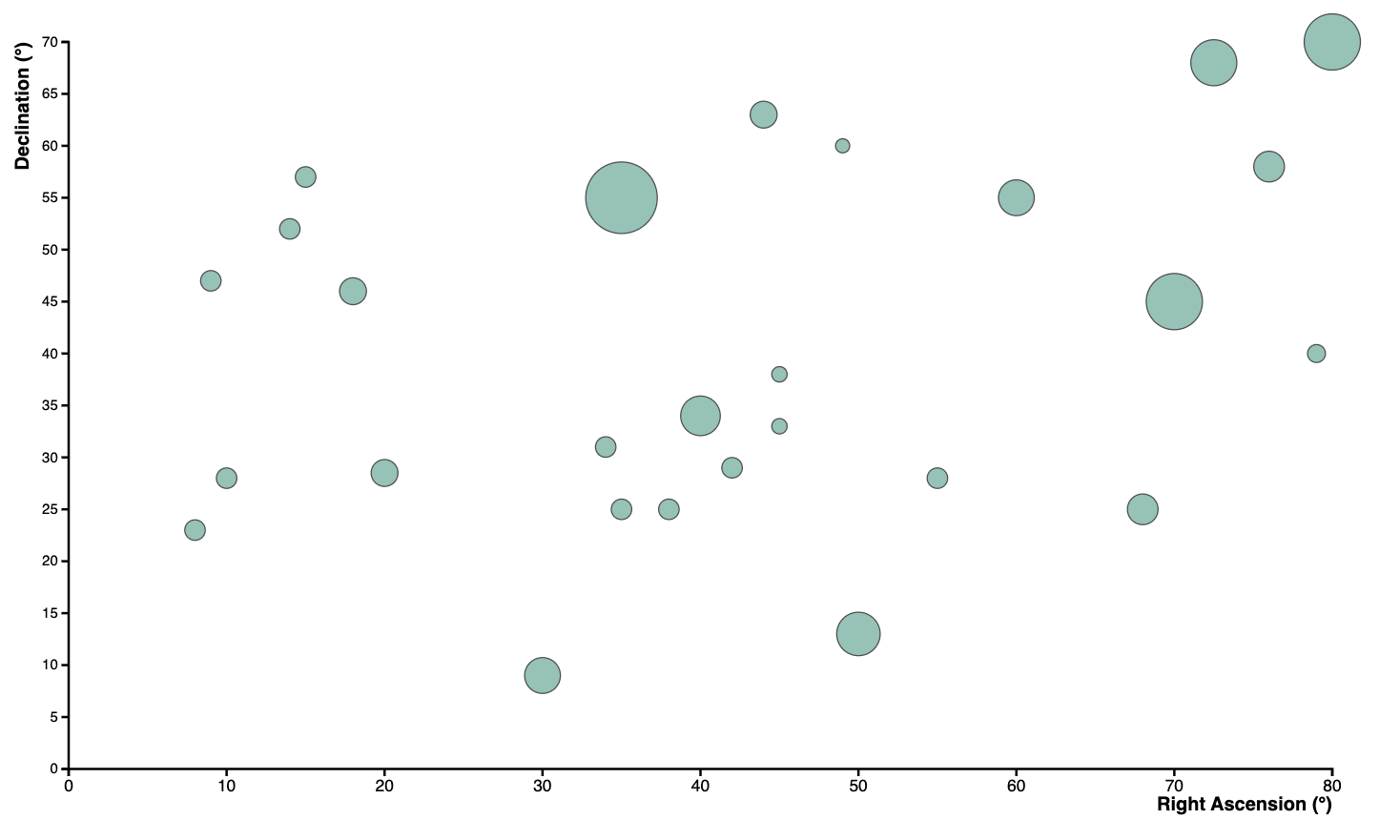
Imagine you are gazing up at a vast night sky, dotted with countless stars. A Bubble Chart can mirror this view, placing each star as a distinct data point in the celestial canvas.
Position and Brightness
Think of the x-axis and y-axis as the coordinates of the sky (e.g., Right Ascension and Declination). The position of each star in the chart indicates where it appears in the sky. Meanwhile, its bubble size (or color) can represent how bright or distant the star is—similar to how some stars shine more intensely than others.
Correlation Indication — Star Patterns
As with scatter plots, a Bubble Chart can reveal patterns or relationships in the data. In the night sky, we often see groups of stars forming constellations. Though constellations are human-imposed patterns, they show how data points (stars) might appear to be related or grouped together—just as your data in a bubble chart may form recognizable clusters or alignments.
Trend Lines — The Milky Way
Imagine the sweeping band of the Milky Way as a “trend line”. It does not include every star, but it visibly dominates part of the sky. Similarly, a trend line in a Bubble Chart might not pass through every data point exactly, but it can suggest an underlying direction or significant feature that many points share.
Clusters — Star Clusters
Just as we have star clusters like the Pleiades in the night sky, a Bubble Chart can reveal clusters of data points that share certain similarities. These clusters can signify important subgroups or trends within the data—like a tight knot of stars shining together in one region of the heavens.
Chart Data (Read-Only)
Visualization Analogy

Actual Chart