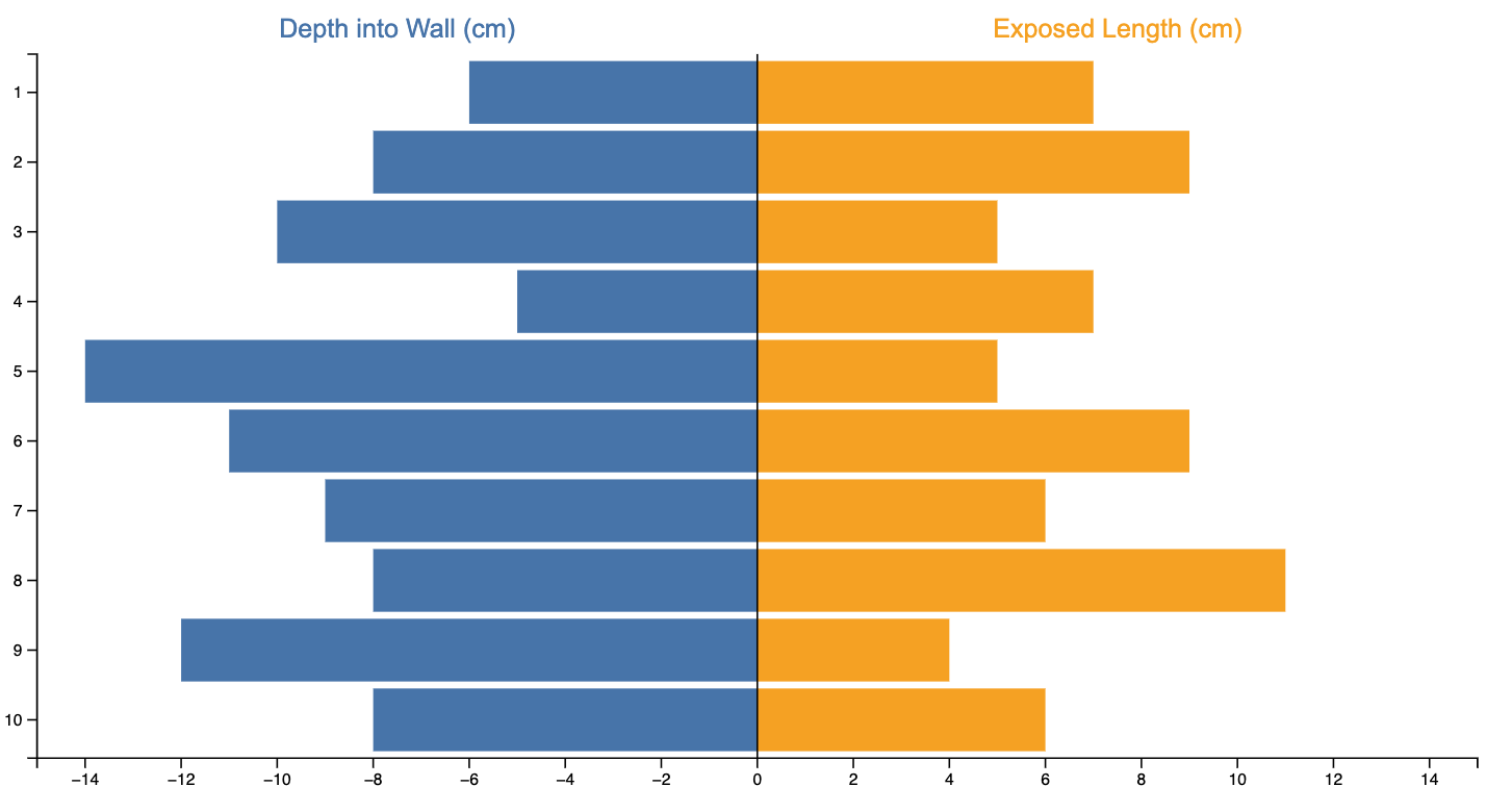
ButterflyChart
Analogy Description
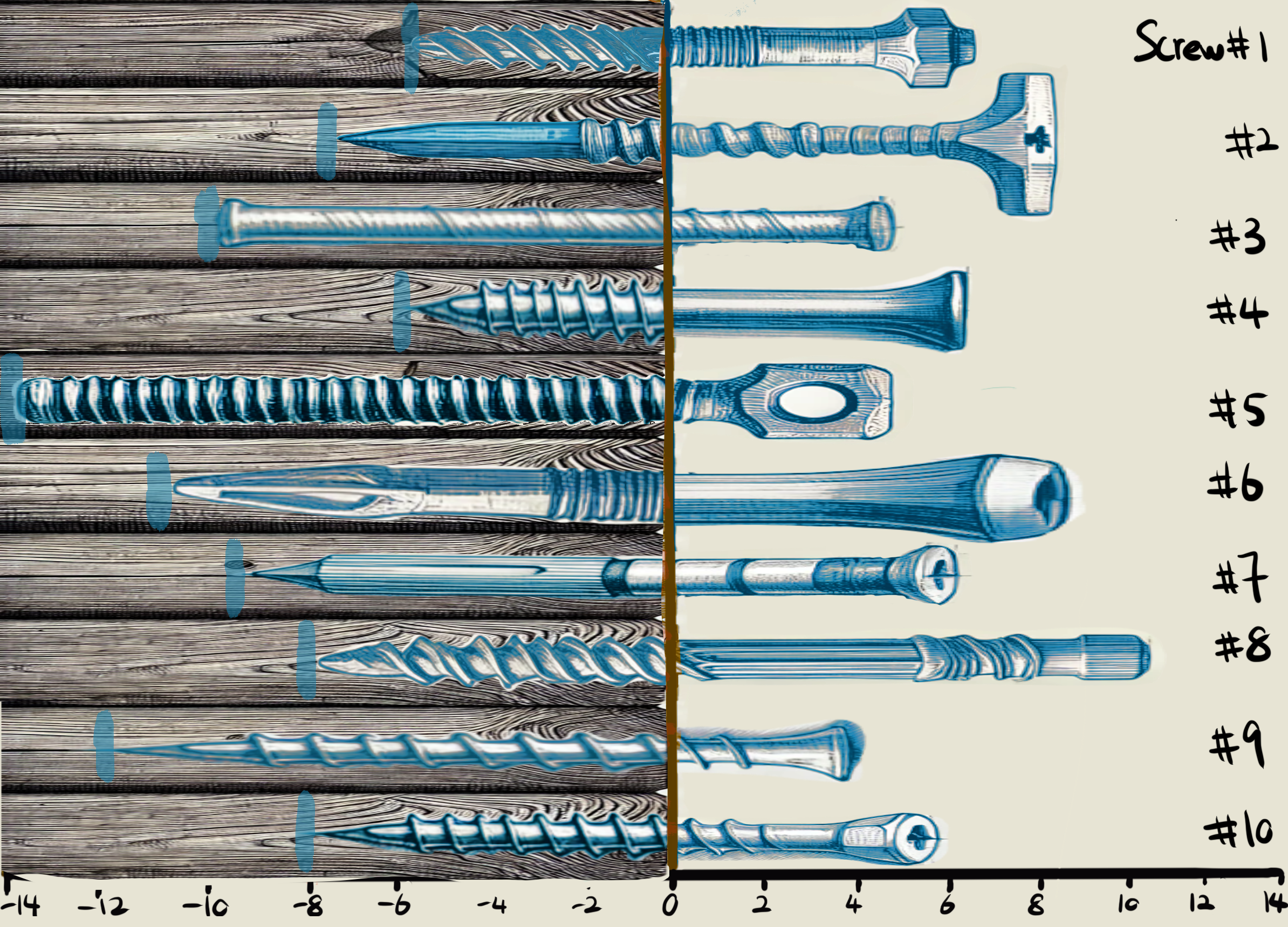
Imagine a series of screws driven into a wooden plank. Some of them are screwed in more deeply on one side, while others protrude on the opposite side. This left-and-right arrangement around the plank resembles a Butterfly Chart, with bars (screws) extending in two directions from the central axis (the plank itself).
Two Sides of the Plank
In a Butterfly Chart, each bar can stretch left to represent one category or group (for instance, negative values or Category A) and to the right to represent the opposing category (positive values or Category B). Think of the wooden plank as the zero line. Screws driven in on the left side show “negative” values, while those sticking out on the right show “positive” values.
Unified Center
The wooden plank in the middle is the shared reference point. In a Butterfly Chart, that “center line” serves the same purpose: to anchor the bars (screws) that branch out in opposite directions. Thanks to this symmetrical structure, you can easily measure how far each data point extends in either direction, much like noticing how one screw might be twisted far into the wood while the next barely penetrates at all.
Chart Data (Read-Only)
Visualization Analogy
Actual Chart