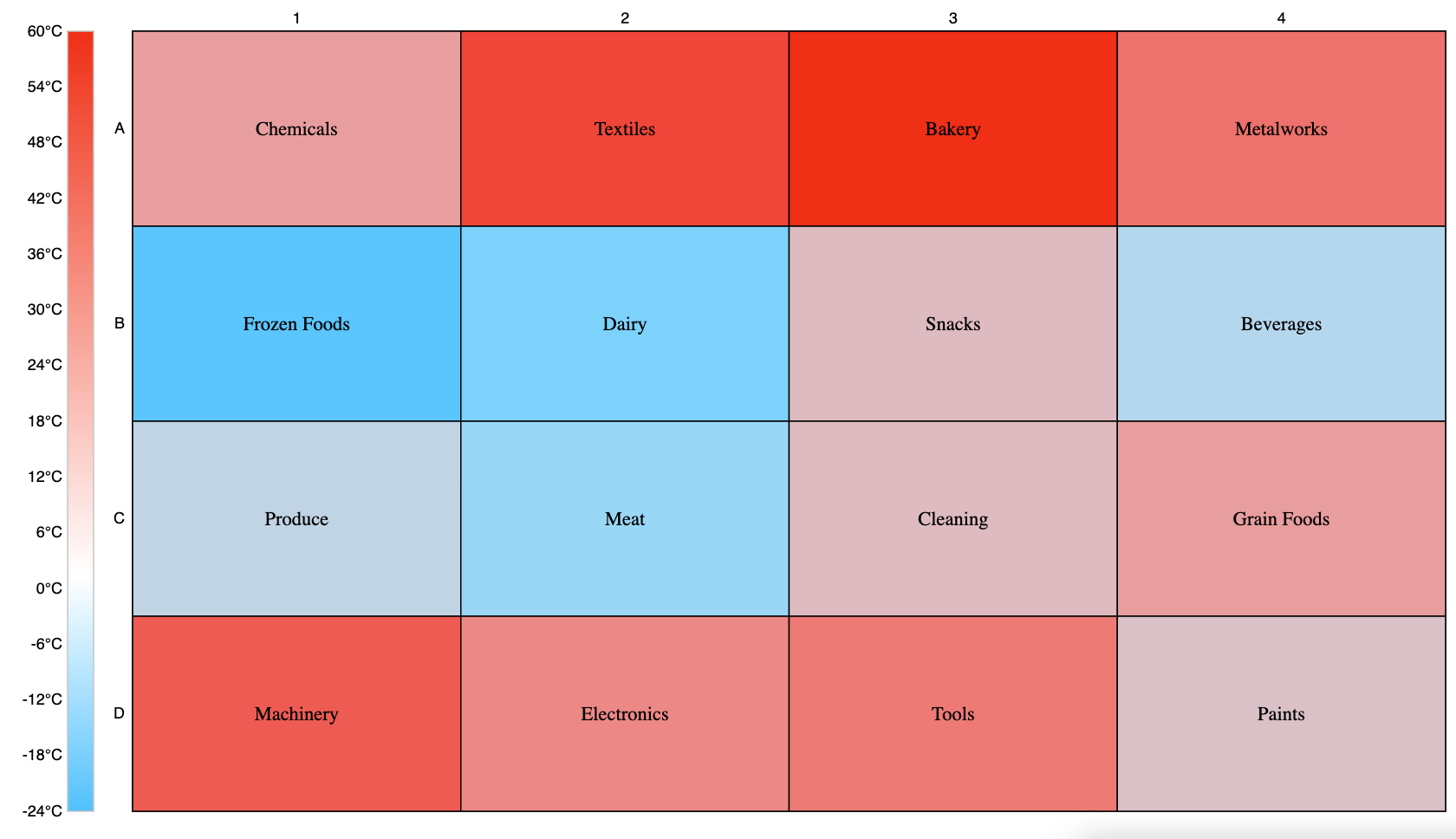
Heatmap
Analogy Description
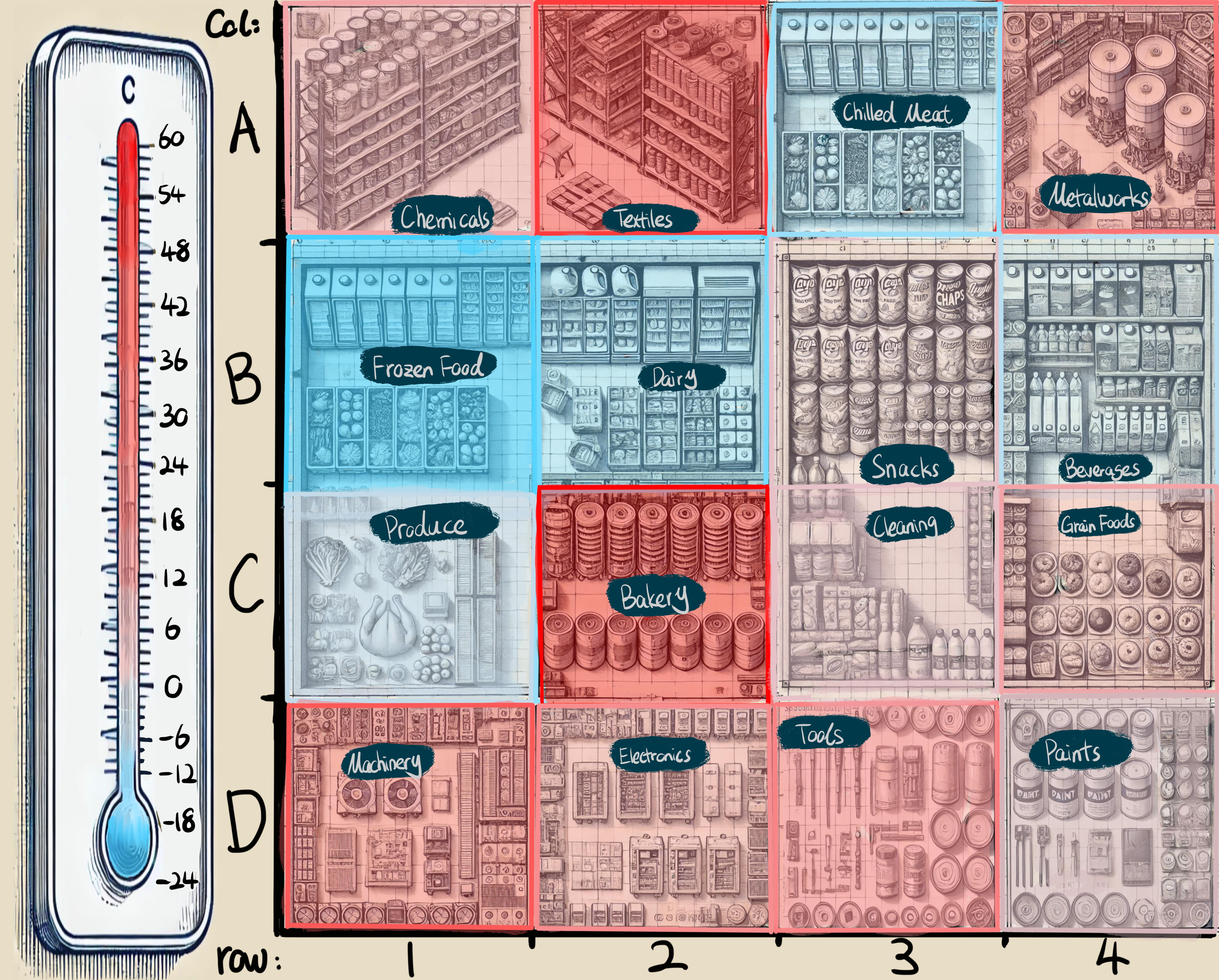
Imagine walking into a supermarket storage area, where each section is stocked with a specific type of goods—like Produce, Dairy, or Bakery. In a Heatmap, every section of this storage grid is color-coded to show how "hot" or "cold" it is—much like temperature zones in a vast storage facility.
Rows, Columns, and Product Categories
Picture the storage floor divided into rows and columns, each cell holding a different category: Frozen Food might be cool blue, while Machinery could be warm red. These colors represent how each category compares to others in terms of a certain measurement—it could be temperature, sales volume, or anything else the heatmap aims to highlight.
Temperature Gauge
In a Heatmap, the colors range from one extreme to another. Imagine a giant thermometer by the warehouse door. As you move from the bottom (cold blues) to the top (hot reds), you can gauge how intense or significant a value is. For instance, darker red squares might indicate high demand or high temperature, whereas lighter blues signal lower demand or cooler conditions.
Spot the Extremes
If you glance across the grid, the colors let you instantly identify which areas are “heating up” or “cooling down.” Perhaps Beverages is glowing red-hot, indicating a spike in sales or production, while Cleaning Supplies is in a calm blue, suggesting a stable or lower volume. This quick visual cue is one of the main advantages of a Heatmap.
Chart Data (Read-Only)
Visualization Analogy
Actual Chart