Sankey
Analogy Description
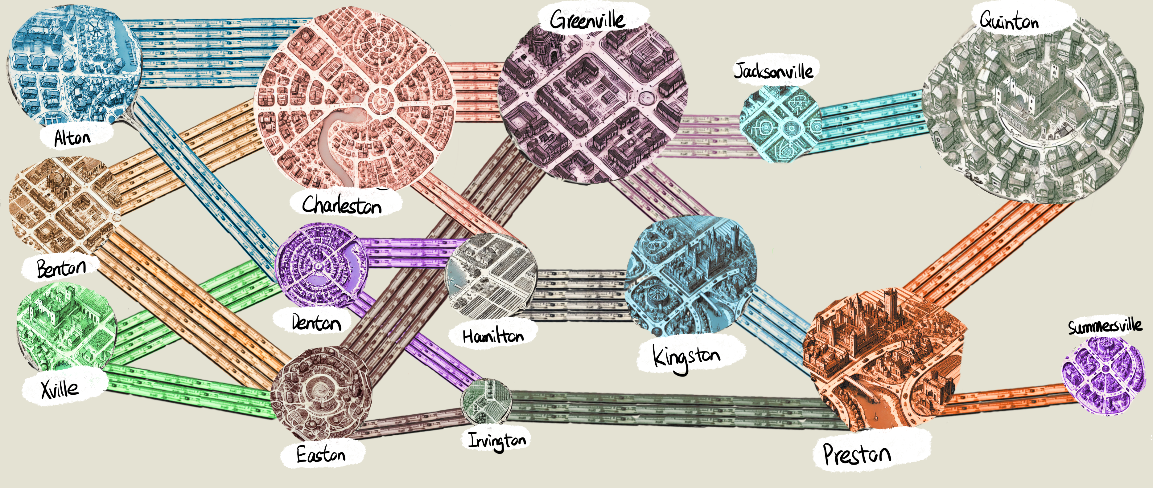
Imagine you have a network of highways connecting a series of towns—each town is a hub of activity. A Sankey Diagram shows you not just the routes from one town to another but also the flow of car traffic along each path, depicted by the thickness of the “highways.”
Cities as Nodes
In a Sankey Diagram, each city becomes a node. Think of it like looking at a regional map from above, where every town stands out as a significant circle or rectangle—your main stops on the journey. The bigger or more prominent the node, the more traffic might be flowing in or out of that particular city.
Highway Lanes as Flows
Each highway connecting two towns is a flow in the Sankey Diagram. The thickness or width of the highway illustrates how many cars travel along that route. A wide road signals heavy traffic, while a narrow one means lighter traffic. This visual cue helps you grasp at a glance which routes are most congested and which are less traveled.
Visualizing Congestion Hotspots
By seeing these thick and thin flows, you quickly spot which highways are busiest, much like noticing traffic jams on an actual road map. Maybe Charleston to Alton is a superhighway jammed with cars, whereas Benton to Denton is a calmer, scenic drive. Sankey Diagrams help city planners (and curious onlookers) figure out where to focus efforts—like widening roads, adding tolls, or directing drivers to alternate routes.
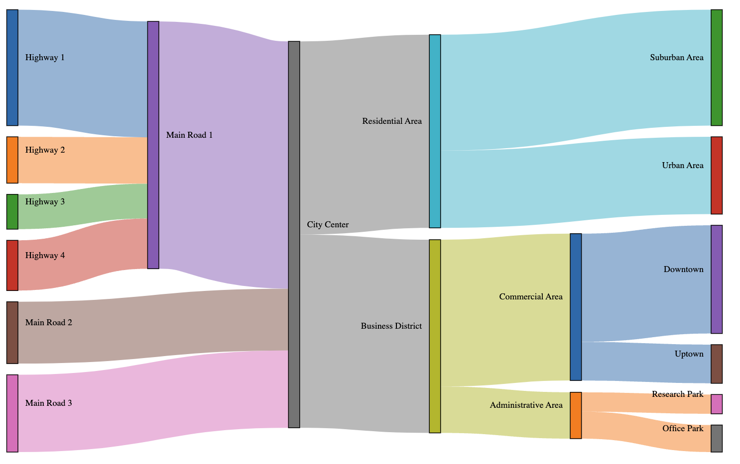
Chart Data (Read-Only)
Visualization Analogy
Actual Chart