StackedArea
Analogy Description
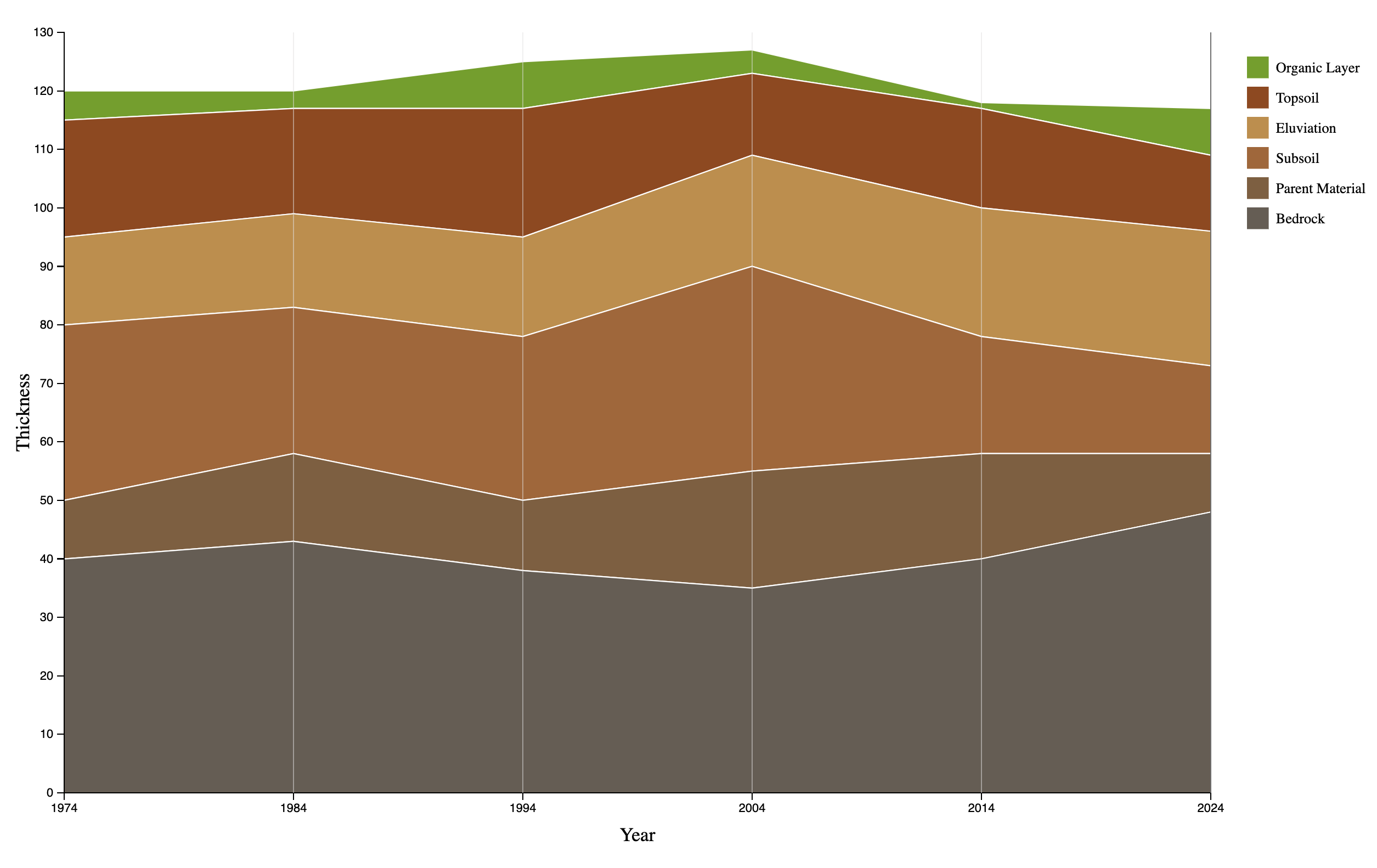
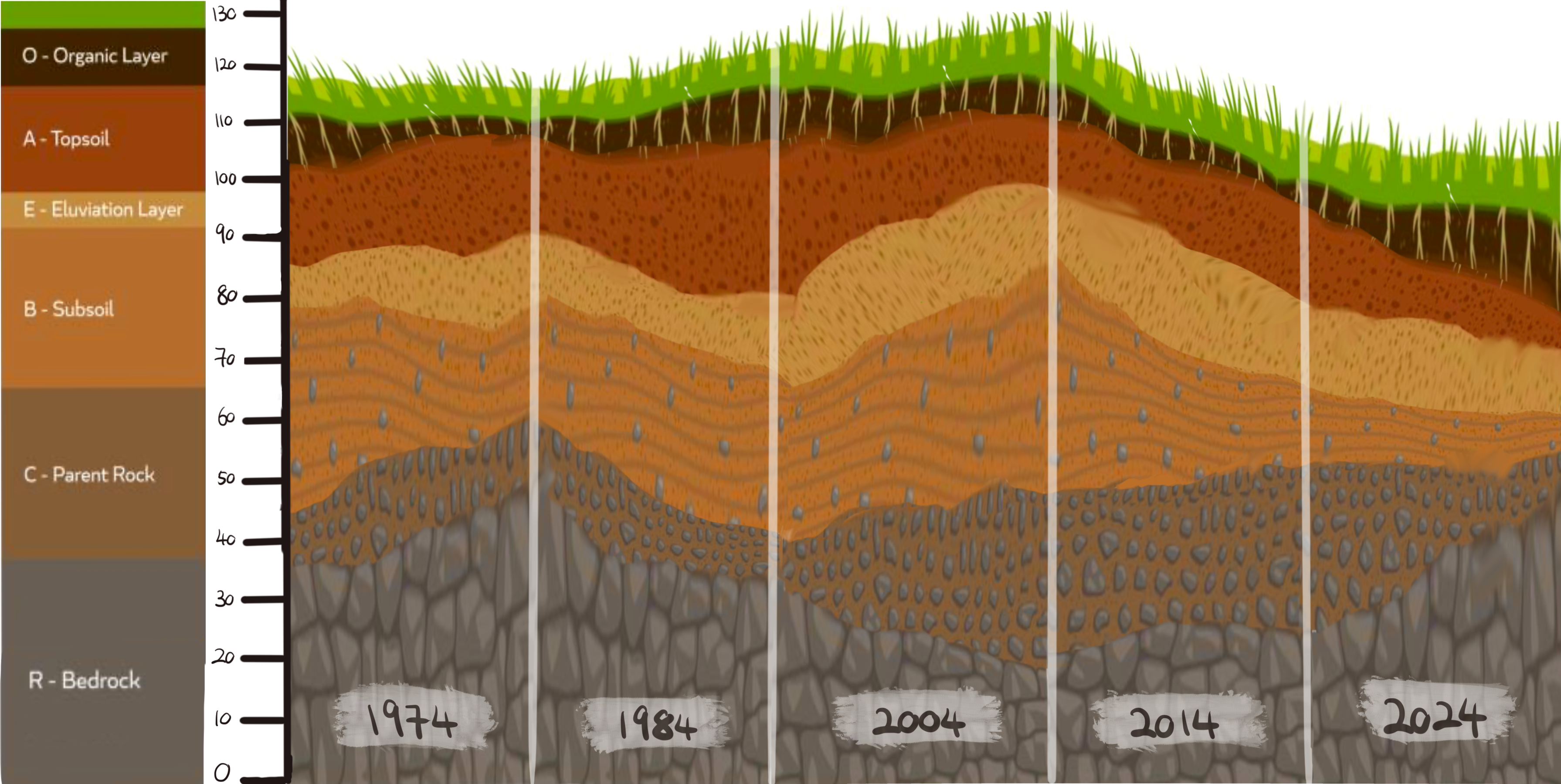
Imagine gazing at a cross-section of the Earth’s soil over several decades, where each layer represents a different component: Organic layer, Topsoil, Eluviation layer, Subsoil, Parent Rock, and Bedrock. In a Stacked Area Chart, these layers are piled one atop the other to illustrate how the soil composition and thickness evolve over time.
Layered Evolution
Each “slice” in time is like a vertical cut through the ground. As you move from one decade to the next, you see changes in the thickness and depth of each layer. The overall shape shows how they stack up together, just like how a Stacked Area Chart displays cumulative changes across different categories.
Decade by Decade
Each decade reveals a new cross-section, showing how the Organic layer might become richer or how the Topsoil shifts over time. This mirrors how a Stacked Area Chart extends along the x-axis to portray trends over chronological intervals.
Total Depth
If you look at the combined height of all layers at each time point, you’ll notice how it may rise or fall as conditions change. In a Stacked Area Chart, the sum of all stacked regions shows the total, while each individual region reveals its contribution to that total—just like each soil layer’s contribution to the ground’s overall depth.
Chart Data (Read-Only)
Visualization Analogy
Actual Chart