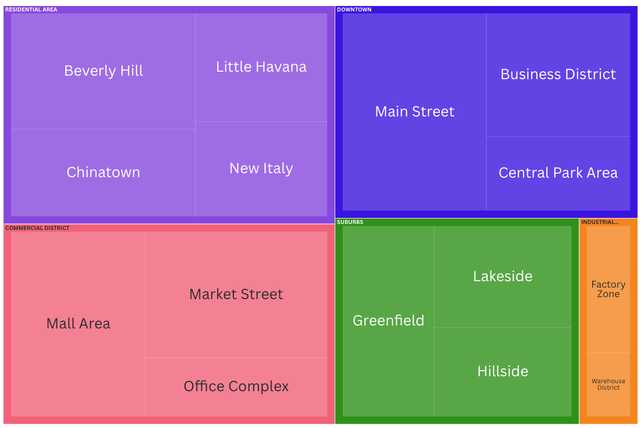
Treemap
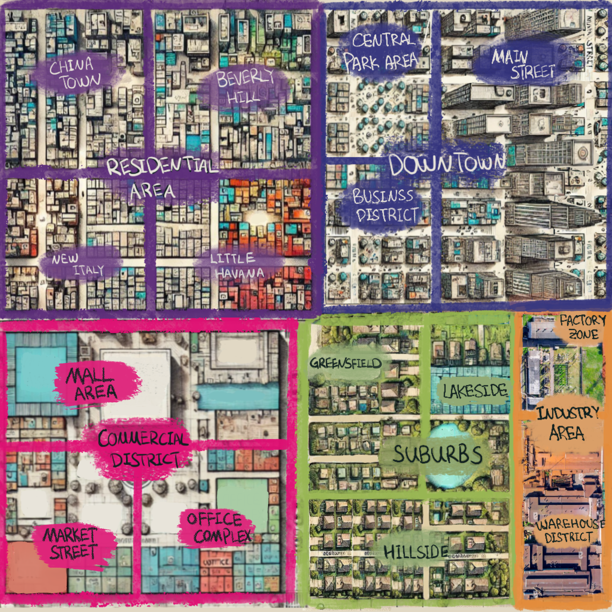
Analogy Description
Imagine you are looking at a city from above at night, and you see various neighborhoods illuminated by different amounts of light. The brightness and size of each illuminated area represent the amount of activity or population density in that neighborhood.
City Neighborhoods
Each neighborhood in the city represents a large rectangle in the treemap. For example:
- Downtown
- Residential Area
- Commercial District
- Industrial Zone
A larger rectangle indicates a bigger neighborhood or area with a higher overall population.
Light Intensity
The size and brightness of each illuminated area represent the population density or activity level. A brighter and larger area indicates a densely populated or highly active neighborhood.
Sub-neighborhoods
Within each large illuminated area (neighborhood), there are smaller areas representing sub-neighborhoods or specific blocks. For instance, within the Downtown area, there are smaller bright spots for specific busy streets or popular spots.
Chart Data (Read-Only)
Visualization Analogy
Actual Chart